The safety net
Saving & comparing
The dot, the banner, and the sheets: how unsaved changes wait for you, how to unwind them at any size, and the three ways to put two futures side by side. · 7-minute read
Nothing travels until you save
Every edit in Monte (a dragged slider, a renamed account, a row adopted from another plan) waits at the door. The header's save button reads Saved ✓ when you're clean and Save all (N) when N surfaces are holding changes; nothing rewrites your saved facts, your plan, or a scenario until you press it. That one rule is what makes the whole app safe to explore.
The dot
A chip wearing a small dot is a surface with unsaved changes. The color carries the stakes: amber on the Dashboard or your plan (your real numbers have edits pending), and the calmer accent on a scenario, where the dirt is sandbox dirt. Wherever you wander, the dots show you the way back to what's unfinished.

The banner
While the surface you're on has pending changes, a banner sits at the bottom of the screen with the only three verbs you need: Review (see exactly what changed), Discard (drop it all), and Save. Its wording follows the surface (“your profile” on the Dashboard, “your plan” on the plan, the scenario's name on a scenario), so it always says whose truth is about to change.

Reviewing before you commit
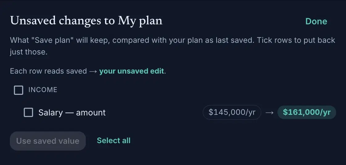
Review opens a sheet listing everything Save would keep, old value → new value, compared against the surface as last saved. That reference point matters: the rail's own Review (on a scenario's strip) answers a different question: how this scenario differs from your plan, regardless of what's saved. Same word, two honest answers; each sheet's subtitle says which one you're reading.
The reset ladder
Unwinding comes in sizes. One row: its Reset, right on the row. One surface, since the last save: the banner's Discard. Back toward the plan the scenario sits on: open the strip's Review, tick the rows you want back, and Use plan version pulls your real numbers in; tick everything and that IS the full reset, itemized instead of blind, and staged so Discard can still undo it. Each rung touches nothing above it.
Deleting is not a rung. In a scenario you don't skip a life event, you delete the row like any other, and ticking it in Review is what brings it back if you change your mind. (On your plan, Skip this is a different thing again, and it belongs to the chart: it draws life without that milestone as a ghost line, writes nothing, and clears when you leave.)
Comparing outcomes on the chart
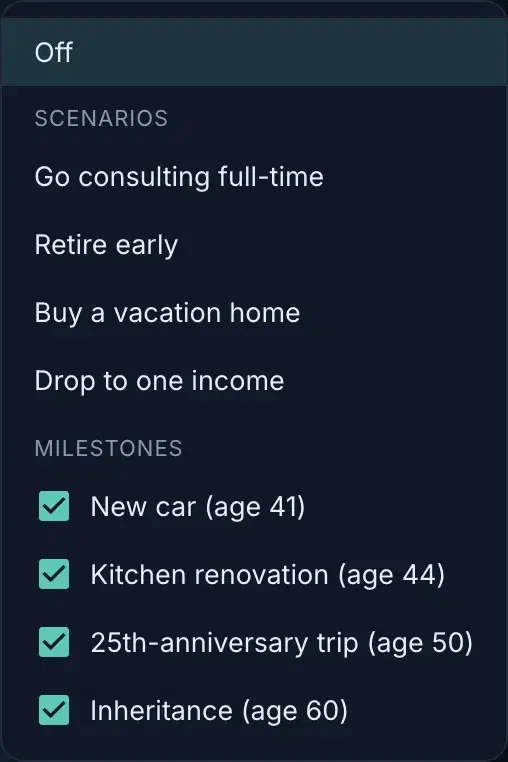
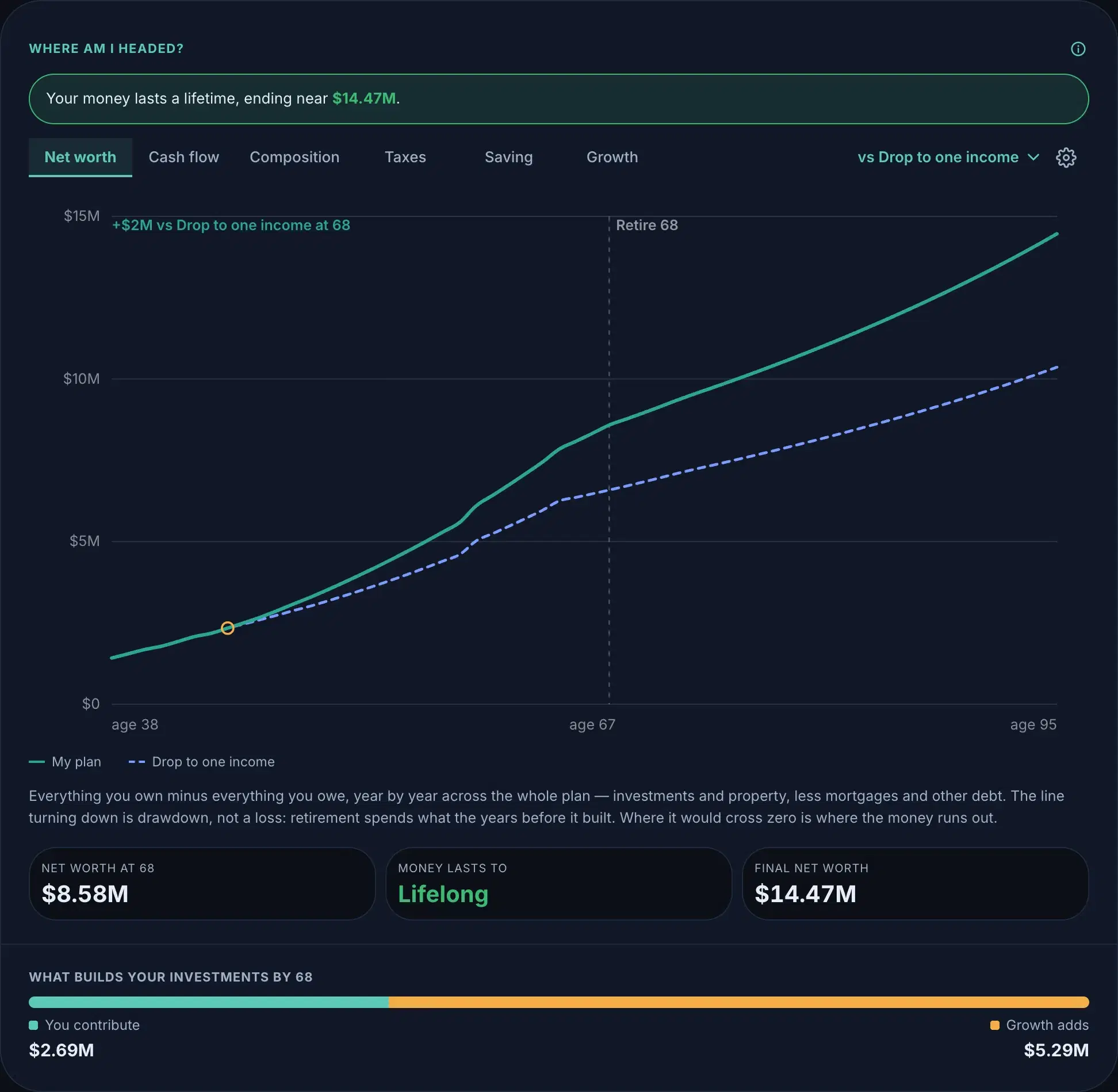
The chart's Compare control overlays a second line on your plan's: a scenario, another plan, or your plan with milestones skipped (uncheck one to see life without it; several stack into a single ghost line). One comparison at a time; picking a new source clears the old; Off returns the chart to just your plan.
Comparing inputs, row by row
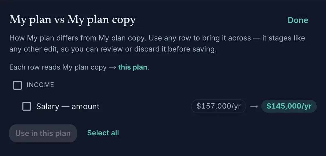
Outcomes tell you that two futures differ; the inputs sheets tell you why. A scenario's menu offers Compare inputs against a same-template peer: settings beside settings. The plans menu's Compare inputs with… does it across whole plans, and goes one step further: any differing row can be brought across with Use in this plan. Adopting stages like any other edit: the banner catches it, and Discard undoes it.
Stacking them instead: the preview
Comparing answers “this future or that one”. Some questions aren't that shape: what if both happens all the time, and two dashed lines can't show you one future where you retire early and buy the lake house. So a scenario can also be laid over your plan instead of beside it. Open any scenario's chip menu (⋮) and pick Preview in my plan; add as many as you like, and they stack in the order you engaged them; a later one wins where two touch the same number.
A strip appears under the chips naming exactly what you're looking at: Previewing: My plan + Retire early + Buy a home. Every chip in the preview wears a small stacked-layers mark. The strip opens a panel where you can add or drop scenarios one at a time, and Review there itemizes what each one puts on top, in order.

A preview reaches the rail too
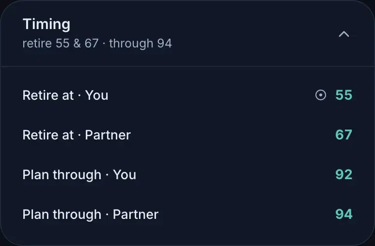
Composition is not only a chart trick. A value a previewed scenario owns shows that scenario's number wearing a ⊙, and the row sends you to the scenario rather than letting you edit it in place: you change a value where it lives, so no edit can quietly vanish under an override.
Nothing is written. A preview is a way of reading, not an edit — your plan is exactly what it was, and dropping the preview leaves no trace. When a mix turns out to be the future you actually want, Make this preview my plan in that panel adds each scenario in the same order, and what you get is what you were looking at.
Which compare is which
Three controls say “compare”: the chart's Compare (outcome lines), a scenario's Compare inputs (settings vs a peer), and the plans menu's Compare inputs with… (settings across plans, with adoption). Chart for whether it matters, sheets for what's different.