Your plan
Down the plan rail
The controls beside your plan, top to bottom: timing, your money, life events, the retirement dials, and the growth rates most people never find. · 7-minute read
The rail is your plan's controls
Open your plan and the right side of the screen is a rail of cards, every one a live control surface over the forecast beside it. On a phone the same cards sit beneath the chart instead. The order runs from “who and when” down through your money to the assumptions everything grows by.
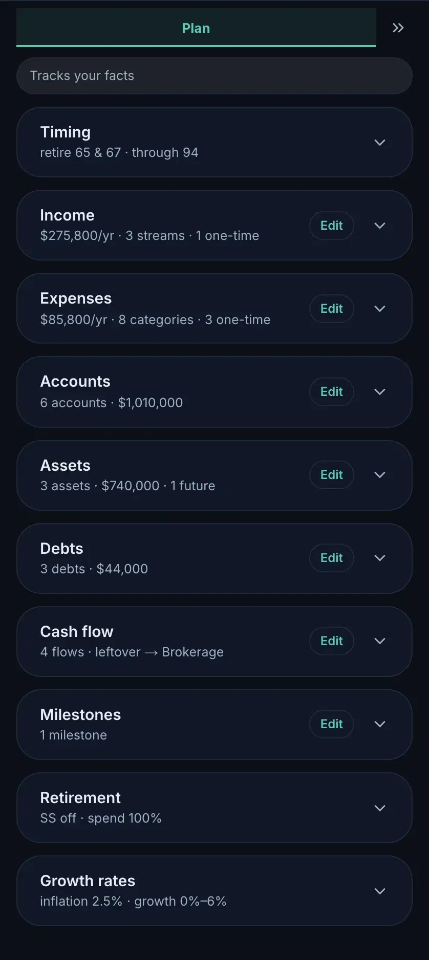
The Dashboard's rail deliberately shows only the six fact sections: no timing, events, dials, or growth. Those describe a future, and futures live in plans; the Dashboard is today. The same rule holds inside its Edit sheets: they ask only what is true now (amounts, balances, who things belong to), and the start/end ages appear when you open the same sections on your plan.
Timing
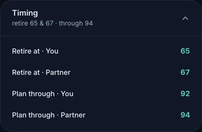
When each of you retires and how far the plan runs. Behind each person's retire-at row sit the streams it ends: a salary stops at retirement unless you say otherwise, and those end-ages are their own rows when you need one to differ.
The six fact sections
Income, Expenses, Accounts, Assets, Debts, Cash flow: the same sections everywhere, with the same rows. Everything about working them (sliders, ranges, units, reset) is its own guide: Working the controls, previous in this series.
Milestones & one-time money
Milestones are moments worth naming — a named age, no money attached. The chart annotates them, and timing fields can anchor to one: move the milestone and everything linked follows. Dated money (a car in 2029, a renovation at 44, an inheritance you'd rather not count on) lives with the money instead: one-time costs under Expenses, one-time cash in under Income, each a row at its age with the amount riding behind it (teal for money in, amber for money out).
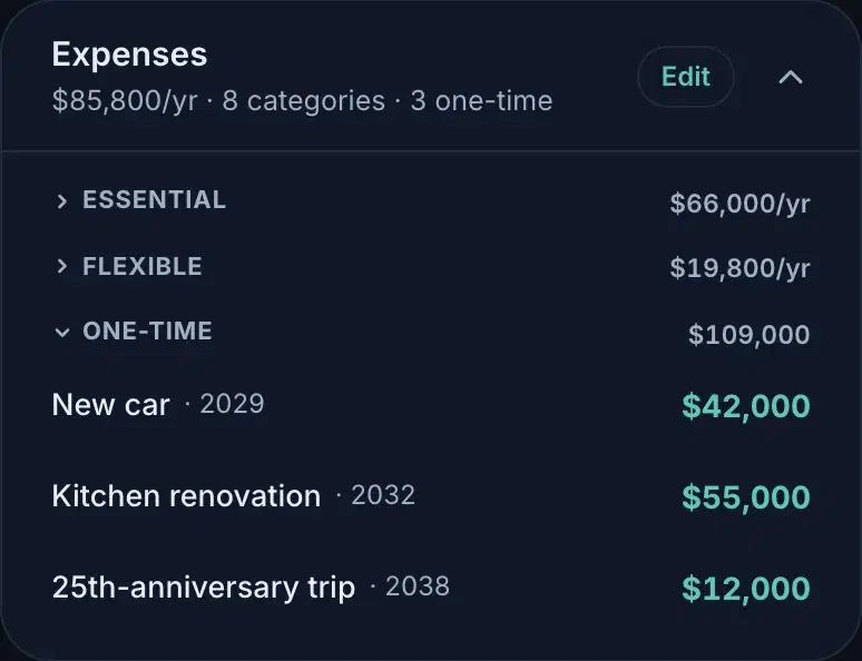
When a scenario is added to your plan, its changes land here as ordinary data: new dated rows like the ones you typed, folded behind a header wearing the scenario's name; a changed dial simply is the plan's value now (this plan retires at 55 because a scenario said so, and Timing carries it like any other fact). The add is a one-off copy: the plan holds these rows until you edit them here or press Add again from the scenario, which overwrites the same rows in place.
The retirement dials
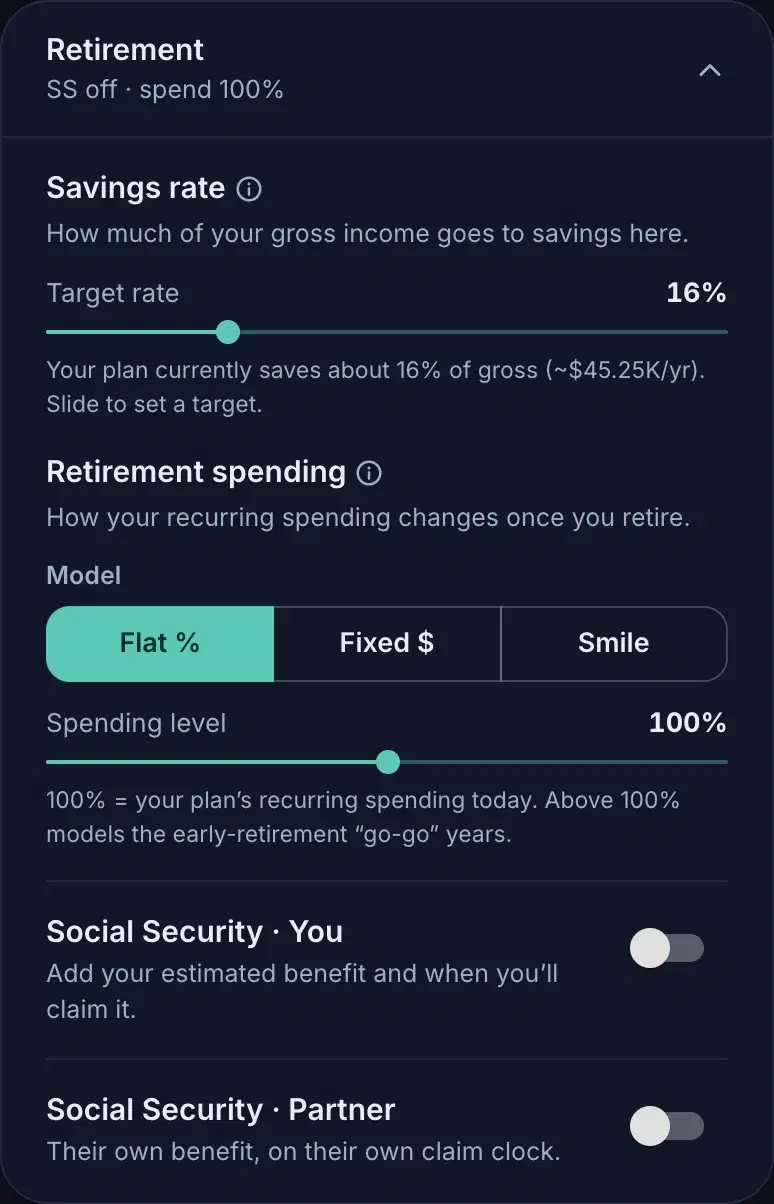
Three dials that shape the arc more than any single row. The savings rate target: what share of gross income the plan saves. Retirement spending: flat, fixed-dollar, or the “smile” that spends more in the early go-go years. And Social Security, per person, each on their own claim clock.
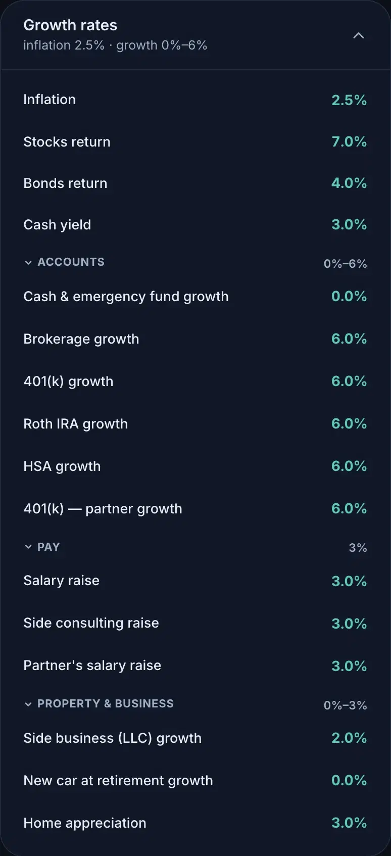
Growth rates
The card most people never find, and the one your forecast leans on hardest. Inflation leads. Then your beliefs by asset class (stocks, bonds, cash), and under them the groups: Accounts (each account's expected return, with per-class overrides tucked behind it), Pay (each income stream's raise rate), and Property & business (appreciation, one row per thing you own).
Growth over time
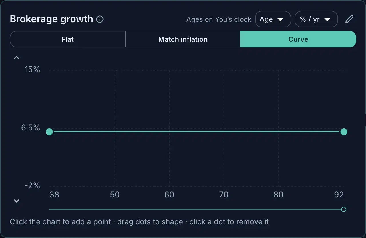
Any growth rate can vary with age. The row's curve control opens an editor with three modes: Flat (one number forever), Match inflation (track whatever inflation does), and Curve: click to add points, drag them to shape a glide path, and the forecast re-runs as you drag. The axis units are yours: ages or years across, nominal or real rates up.
Scenario tab, Plan tab
On a scenario, the rail grows a second tab. Scenario holds only what that lens asks: the retirement age, the career switch, the home purchase. Plan is this same rail, identical on every surface, so the full controls are always one tab away and nothing you learned here has to be relearned anywhere else. Which tab a change belongs to is the fact-versus-hypothetical rule from Facts, plans & scenarios.